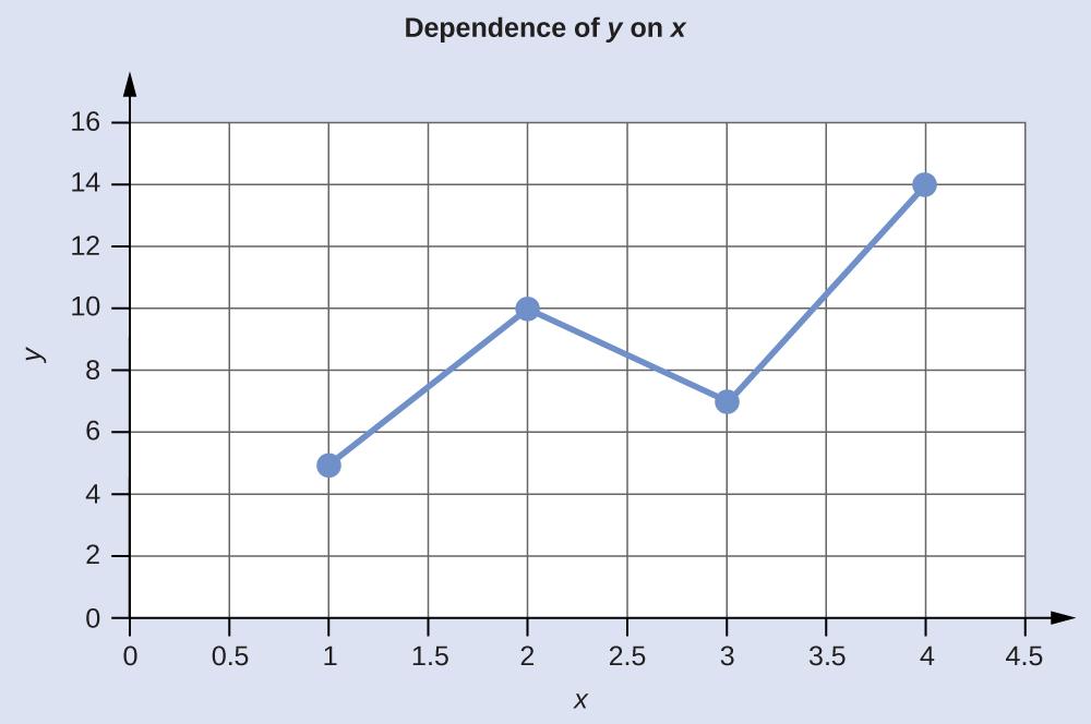
The relationship between any two properties of a system can be represented graphically by a two-dimensional data plot. Such a graph has two axes: a horizontal one corresponding to the independent variable, or the variable whose value is being controlled (x), and a vertical axis corresponding to the dependent variable, or the variable whose value is being observed or measured (y).
When the value of y is changing as a function of x (that is, different values of x correspond to different values of y), a graph of this change can be plotted or sketched. The graph can be produced by using specific values for (x,y) data pairs.
Graphing the Dependence of y on x
| x | y |
|---|---|
| 1 | 5 |
| 2 | 10 |
| 3 | 7 |
| 4 | 14 |
This table contains the following points: (1,5), (2,10), (3,7), and (4,14). Each of these points can be plotted on a graph and connected to produce a graphical representation of the dependence of y on x.

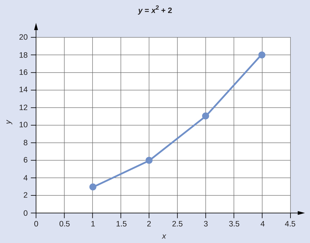
If the function that describes the dependence of y on x is known, it may be used to compute x,y data pairs that may subsequently be plotted.
Plotting Data Pairs
If we know that y = x2 + 2, we can produce a table of a few (x,y) values and then plot the line based on the data shown here.
| x | y = x2 + 2 |
|---|---|
| 1 | 3 |
| 2 | 6 |
| 3 | 11 |
| 4 | 18 |
