As we saw on the previous page, the particles in a gas sample will be moving at a distribution of speeds, with one most-probable (or most common) speed. To describe the effect of temperature on the particles’ motion, we need to know that
The Kelvin temperature of a system is directly proportional to the average kinetic energy of that system.
We can see this directly in the relation: $$T = \frac{2}{3}\frac{\bar{\text{K}}}{k_B}$$
where:
$T$ is the temperature in Kelvin
$\bar{\text{K}}$ is the average kinetic energy of a particle in the system
and $k_B$ is the Boltzmann constant.
Remembering that kinetic energy is defined as $K = \frac{1}{2}mv^2$, we can temperature to the particle speed: $$T =\frac{\text{m}\bar{v}^2}{3 k_B}$$
where
$\bar{v}$ is the average speed of the particles
and $m$ is the mass (molecular or atomic mass: we are assuming that only one type of particle is present, so there is only one mass).
From here, we can see that the temperature is directly related to the square of the average speed: as temperature increases, the average speed of our particles also increases. However, since the collection of particles aren’t identical – remember, they are moving with a distribution of speeds – that doesn’t necessarily mean that every particle moves more quickly.
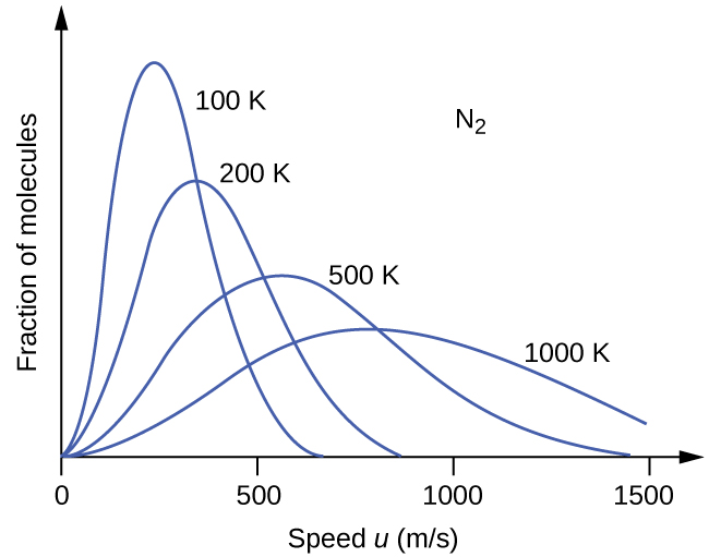
Below, we can see the plots of F(u) – the fraction of molecules at a given speed – at various temperatures for a sample of nitrogen gas (N2).

Investigating this figure, we can notice two important things: First, as the temperature increases, the most-probable (and average) speed increases – in other words, we see the peak (the speed with the biggest fraction of molecules) shift towards higher speeds at higher temperatures. This agrees with what we predicted from the mathematical relations above.
Second, as the temperature increases, the distribution doesn’t just shift, it also gets broader. This isn’t obvious from the math above (it comes from the Boltzmann-Maxwell equation on the previous page). But, it is an important observation! At 100K, most of our molecules have a fairly similar set of speeds – they’re all gathered together in a few high-frequency zones, and the “tail” off to higher speeds is relatively small. At 1000 K, we still have some molecules moving at a lower speed, but also more at the higher speeds, so the distribution gets spread out (and “shorter” – spreading the same number of molecules out across more speeds means that our largest fraction isn’t as large as it was before).
Knowing how the motion of the particles in a gas sample changes with temperature will help understand how temperature changes reaction rates and equilibria in coming chapters.